Studio R—P
The Greatness of Void: Why Less Really Is More in Design
05/30/2025
•
SHARE ARTICLE
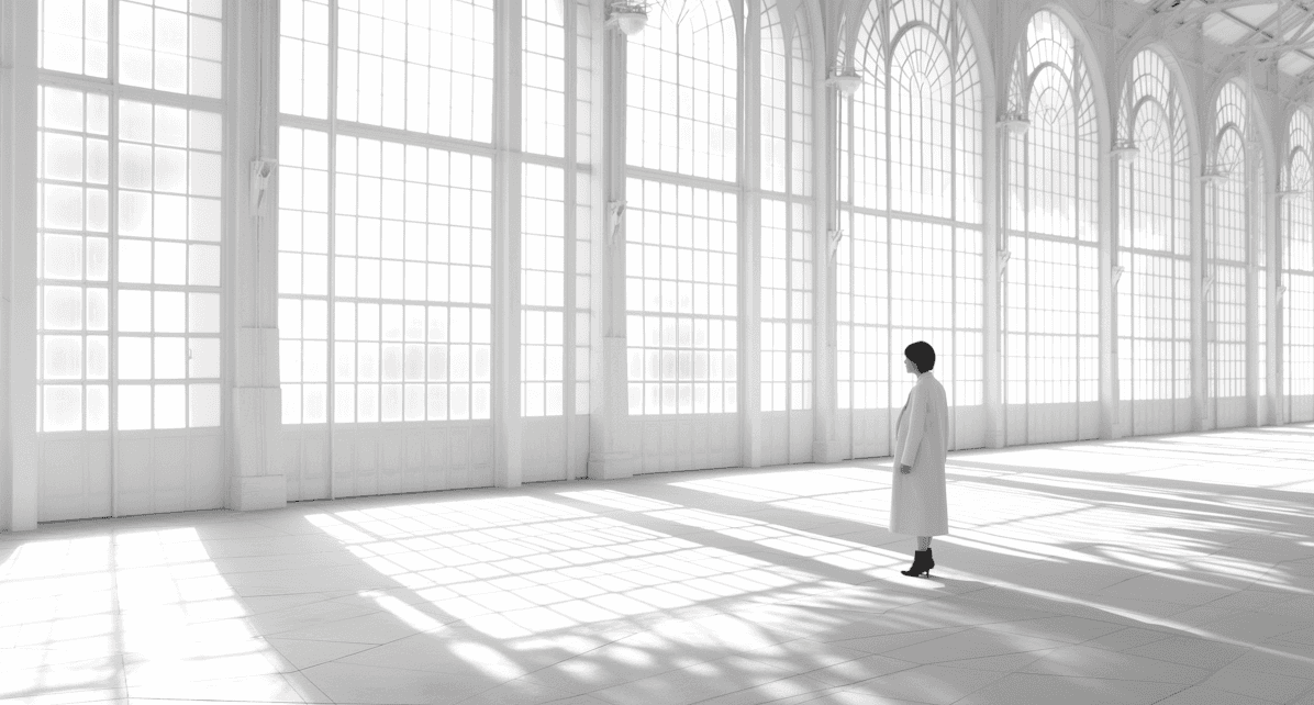
In a world oversaturated with content, design has the unique power to create clarity and focus. I believe that void space—sometimes called white space or negative space—is one of the most powerful tools in my toolkit. It might look like nothing, but it does everything. Void space isn't empty; it's intentional. It gives your content room to breathe, draws attention to what matters, and creates visual harmony.
What Is Void Space?
Void space is the area between and around elements in a design. It could be the space around a heading, the margin in a brochure, or the quiet pause in a presentation slide. Think of it like the rest in a piece of music—without it, there's no rhythm. It's the pause that gives weight to the note. In design, that pause is what allows the message to land.
The Emotional Impact of Space
A layout with intentional space feels elevated. Minimal, spacious compositions communicate confidence, elegance, and restraint. They feel premium because they suggest that nothing more is needed. That kind of clarity creates emotional impact—it calms the viewer, invites them in, and makes the content feel curated and important.

Functionality Meets Beauty
Void space isn't just a visual choice; it's functional. It improves legibility, strengthens hierarchy, and guides the eye. It's essential in creating effective brochures, websites, and presentations. Space directs flow, making complex information easier to absorb and experience.
Common Mistakes
One of the biggest design mistakes is the urge to overfill. Adding too much text, too many visuals, or squeezing content into every available inch often stems from the fear that emptiness means lack. In reality, the lack of space can make even the best content feel overwhelming or undervalued. Design thrives on balance—and that requires trust in the space between.
How I Use Space in My Work
Void space is never an afterthought in my process. Whether I’m designing a brand identity, a 32-page brochure, or a website, I use space to frame meaning. My work in architecture, hospitality, and property development relies on clarity and storytelling—and space is a key narrator. It invites users in, allows ideas to breathe, and adds the kind of polish that makes a brand unforgettable.
You can even see the power of space in the card designs I create at scribblesandpaper.store. These pieces combine modern aesthetics with breathing room—letting each element speak without shouting. When form meets function through void space, something quietly beautiful happens.
Space Is the Statement
Design isn't just about what you add—it's also about what you choose to leave out. I design with intention, knowing that the quietest parts of a layout often say the most.
Need help creating a brochure, website, or presentation that feels both impactful and elegant? Let's make space for something remarkable.
Roberta Phillips
other articles
More to read


Newsletter
Subscribe to our newsletter and stay in touch with us.
General Questions
Newsletter
Subscribe to our newsletter and stay in touch with us.
General Questions
Newsletter
Subscribe to our newsletter and stay in touch with us.
General Questions